Sometimes, we get so caught up in our own lives that we forget or are blinded about what we project to others, what we see as “Great” or “innovative” on our website are considered to others, one or more of the 7 deadly website sins, so today we are looking to cleanse our websites of sin.
Your website is both an interactive and virtually an unlimited medium, meaning that your own little corner of the internet has huge potential for you. Therefore, don’t settle for anything except the best.
But, how exactly would one define a ‘sinning’ website?
of course it is, Not to worry though – we’re here to get you back on that righteous path!
Let’s review some of the 7 deadly website sin signs, along with some quick and easy Hail Mary’s.
- Ghastly
- Monotonous
- Apathy
- Inadequate
- Misleading
- Pairing
- Plagorism
1. Ghastly.
Colors & images, we all love to see them and with the amazing high definition screens that are currently on the market it makes sense to play it to our advantage. unfortunately this all comes at a huge cost to our sites load times.
Use them sparingly to enhance text or to highlight context to the text, NEVER use an image because you “Just like it” as that would be Ghastly.
The Hail Mary: Colors should enhance a page or highlight a side article, stay away from block colors unless they are fient pastels and ensure your color scheme is uniform throughout your whole site as this plays a part in subliminally telling your client that they are still on your website and have not been redirected elesewhere, be careful of color clashes, to help find a great scheme for your site I use Adobe Color, if you are using a certain image, its a good idea to take a dropper test from the image to pull some of the colors into your site that way colors wont clash with images, I use Image Color Picker
2. Monotonous
A monotonous website will contain no character, it will contain no UX, imagery will be all over the place with no coherent reasoning, there’s no opportunity for interaction, branding will be non consistent and it will display a slap dash approach that will infect your brand
If you are going to do something then give it all you have, your energy and exhuberance for what you do should propagate to the page.
The Hail Mary: Overcoming this sin is relatively easy, it just takes time, patience and research of your subject. Plan your page out on paper first from your goal backwards, bring together all the content that you want your client to know about and display it in a layout on paper, include relevant images to orchestrate the text.
3. Apathy
Your blog hasn’t been updated in months (or years). Apathy has set in and you’re uninterested as it doesnt bring you any new clients anyway, so why bother.
There’s nothing more boring than visiting a website where the “latest” blog post is a few years old. It sends the message that your site isn’t a priority and creates a perception that you don’t have anything interesting to say.
The Hail Mary: Running a business is difficult and free time isn’t always readily available. Finding extra bits of efficiency wherever you can could help free up some time for writing. A good example of this is finding a web host that takes care of mundane tasks such as updating your content management system’s software for you. It’s one less thing you have to worry about and lets you focus on the good stuff.
4. Inadequate
Lets grab a theme and make it my website, I’ll just change some images and text and its done, is that what you thought you could do?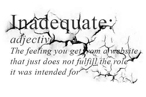
In a very miniscule way, that would work, but the service you provide is unique, so why isn’t your website!
Will that theme elevate your product or service to where you need it to be, the theme will contain certain styling that may need to be changed to be cohesive with your branding, there is no “Gallery” to display your work or products.
The Hail Mary: Shop around, take your time to find a theme that fits your quota, be prepared to make changes to a theme to fit your company, don’t try to fit your company to a theme.
5. Misleading
 Outlandish claims of service or products, saying you can deliver something that your competitors can’t and not livin’up to your claims.
Selling subserviant service to what is proclaimed.
The Hail Mary: Let your site reflect you and your business ethos in an open and honest way, be truthful with what you can do and humble with what you can’t.
6. Pairing
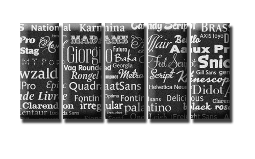 Font pairings are all wrong and far too many on one site, think of the Font being the voice of text, some fonts display screamimg, they are loud and vicious looking, so why would you use them to create peaceful tranquility on a YOGA website, nor would you want a fine serif font for an engineering site.
With hundreds of thousands of fonts currently on the market, means you can pick and choose, don’t be scared to experiment but be careful of your choices
The Hail Mary: This amazing website by Lou Levit is a testament to this art of pairing, keep the maximum amount of fonts to 2 or 3, 4 at a push.
7. Plagorism
Dont steal others work, thats downright “LOW” and thats all I have to say on the matter. By all means use someones else’s work if its GPL or you have permission but ALWAYS link back to the author/designer with credit.
The Hail Mary: Create your own work by connecting with your customers, orientate your site towards meeting their needs.
Recovering from SIN
If you have discovered that your website is suffering from one or more of the signs above, know that you are far from alone. Often, it seems like we start off with the best of intentions when it comes to our websites – only to move onto more pressing matters as the years go by. It literally could happen to any one of us.
But, as we’ve found, recovery can become a reality. A few simple steps can turn a site full of sin into something much more interesting. And, if you feel your current site is a lost cause, you can take comfort in knowing how to approach the next one.
Now, take what we have spoken about and use it to ensure that your website lives up to its vast potential. You can do it!
To get things done right, we always seem to get them wrong – first !
It’s how we learn of course, making mistakes and learning from them and lets face it, we have all watched those DIY programs and thought – “Hey ! I can do that, it’s easy?”.
First it was the likes of HOMEBASE, B&Q, IKEA etc. etc. etc..
But now it seems to have extended to every area of our lives, we seem to think that if we do it ourselves,
it will save me so much money by not getting a professional to do it for me.
-Me
To DIY or not to DIY, that is the question
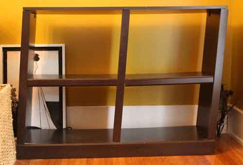
Now DIY might be great for putting up that shelf, changing the air filter in the car or painting a door.
Now for the small part I agree with that but for the large part I don’t and my reason are this-
- Would you buy a Porsche car and then wash it with a “Brillo” pad?
- Would you build a pool and not grout the tiles?
- Would you build yourself a garage without measuring your car?
These all sound very silly, I know, but they are basically an analogy of how people approach their business website.
Why would you project all your conceivable energy and expense into building an amazing business and allow it to be projected to the WORLD on the internet as a mediocre company with no sales funnel, using pix-elated images out of context to the content, spend all your costly time trying to make it look professional but miss out on the (lets call this list “The Crucials”)
- CTA (Call to Action)
- The demographic they are appealing too
- Website load times, backlinks, SEO, responsiveness, xml-sitemaps, UX (User Experience).
- Using engaging content/context that funnels perspective clients to your desired goal
- Scaling all your images that you upload so they wont slow your site right down leaving your clients twiddling their fingers or better still looking elsewhere.
- The cautious use of font pairing, not overloading on H1 tags without knowing the implications, allowing for designated whitespace to minimize eyestrain for your client.
- And what happens when you need to start to use code and the whole things disappears through a simple error, the dreaded “WHITE SCREEN OF DEATH”. on a side note a lot of designers wont touch or fix other peoples mess’s, if they do they will almost definitely charge you handsomely for it.
- Lets not forget the “Golden Ratio” the Fibonacci Sequence, perfectly described here
- Fashion – Yes in web design, trends as we like to call them, tell your clients that you are upto date with your business, what would an outdated website tell your customers about you?
But then the usual response to the above is……
Oh, I’m gonna use one of those “Drag and Drop thingy Website Builders”
The drag and drop……….YUK……
Code Bloat at its worst and that is the best part of it…
Lets imagine for a minute or two five, you have just started a business, you have projected its turnover to be in 5 years over 200K-Per Annum providing a stable income for your family, you have worked hard at it, it is in your area/niche of expertise, you had a signage creator make your sign and it stands aloft your business entry, you polish it every day projecting your pride in what you do. The day has arrived and you want to take your business to the WorldWideWeb, you decide to make the website yourself.
You choose a drag and drop, you are oblivious to the “Crucials” and you wonder why you even bothered, your “Bounce” rate is through the roof, you are getting no interest at all from your website, your lack lustre sales funnel is blocked, yet it all looks “Pretty”, well pretty is good but…….
Design is imperative.

Function Orientated
Design

Design orientated
Functionality
When done right, it alters consumer perceptions, provides relevance, it’s the cornerstone for credibility, enhances professionalism, and creates trust with your audience — Yes it has to be pretty, but it must actually work to engage emotions towards an action to increase sales.
There is so much more that goes into designing and building a functional, sales projected website, it is a tool that will work for you 24/7, it’s more than simply dragging a pretty little picture into a blank page.
The Internet is crucial for Business, Internet usage has increased incrementally, it’s imperative that your business is seen and projected professionally too.
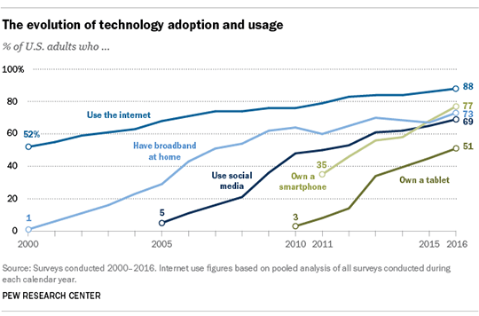
image courtesy of http://www.pewinternet.org
DIY it’s not all bad
They have their place, they do what say they will do, but you get what you pay for at the end of the day.
I will make this promise to you, if you don’t use a DIY Website builder, I promise you, I wont perform my own appendectomy, fly the plane myself for our family holiday, drill for my own oil in Saudi, perform my own cremation?????
A GREAT BUSINESS DESERVES A GREAT WEBSITE